Brand Identity | Website Design | UI/UX
The Challenge
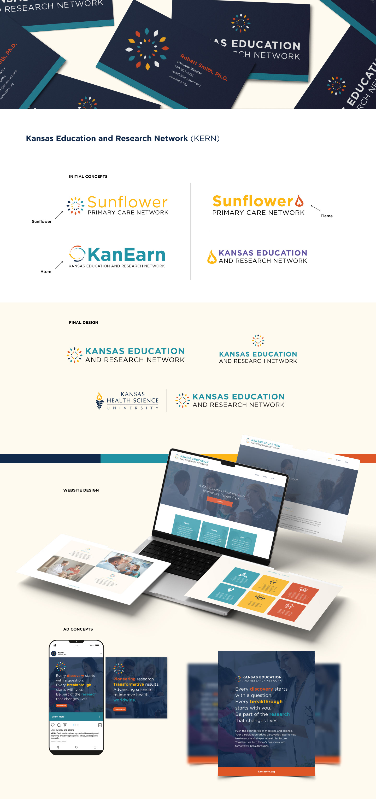
Kansas Education and Research Network (KERN) is a dedicated research body within Kansas Health Science University (KHSU), this initiative was designed to foster collaboration between students and physicians, creating opportunities to improve patient care and support ongoing education. To maintain brand recognition, we incorporated key elements of KHSU’s established color palette, ensuring a cohesive visual identity that connects seamlessly with the university’s broader brand.
The Approach
Three initial branding concepts were presented, each with its own distinct icon. All concepts utilized two of Kansas Health Science University's brand colors and a consistent typographic style. As the designs evolved, the naming process was still underway, with the final decision landing on Kansas Education and Research Network (KERN) — a name chosen to reflect the mission and scope of the brand.
The three proposed icons included:
Flame
Inspired by the existing KHSU logo, the flame was designed to visually connect KERN back to its parent brand. This concept emphasized brand continuity and recognition.
Inspired by the existing KHSU logo, the flame was designed to visually connect KERN back to its parent brand. This concept emphasized brand continuity and recognition.
Atom
The atom icon symbolized the integration of education, networking, research, and science. The circular form brought these four pillars together using multiple colors to reflect the community-driven values of KHSU. Its abstract, scientific feel visually reinforced KERN’s dedication to innovation in healthcare research.
The atom icon symbolized the integration of education, networking, research, and science. The circular form brought these four pillars together using multiple colors to reflect the community-driven values of KHSU. Its abstract, scientific feel visually reinforced KERN’s dedication to innovation in healthcare research.
Sunflower
Representing the state flower of Kansas, this icon used alternating colors in each petal to convey unity and collaboration. Like the atom, it symbolized the core elements of KERN’s mission — education, research, networking, and science — and how they work together to drive progress in healthcare.
Representing the state flower of Kansas, this icon used alternating colors in each petal to convey unity and collaboration. Like the atom, it symbolized the core elements of KERN’s mission — education, research, networking, and science — and how they work together to drive progress in healthcare.
The Results
Once the final brand identity was selected, it opened the door to fully develop and expand the brand. This included creating a full suite of materials such as flyers, advertisements, business cards, letterheads, a website, and more — bringing the brand to life across every touchpoint.